


For the past couple of days we've been continuing with our group project on student employment promotional material, I've already posted drafts and prototypes for our 'paper fortune teller', but we've really kicked off with it today. There is now a functional printed version, and other mock ups & prototypes. I'm pleased to see we've stuck to our original design concept.

Part of my tasks today have included redesigning some of the information going into our flyer/poster, I suggested pie charts, because I think especially at the moment info-graphics are really cool within the contemporary graphic design community. Above are 4 different takes on the pie chart we proposed, because it's always nice to have options. Together we've decided on the bottom-right chart, so that should make the final cut of our campaign.


Another piece of research I've done today is into font pairings, I've briefly looked into it before as I feel it's an absolutely essential piece of knowledge. It's really important to know which fonts work with which others, and what kind of tone it sets for the rest of the work. I had always assumed that a lot of the time, designers judge it by eye using only instinct, but it's interesting to find how so much more is taken into account. For example: Kerning, it's important that the two fonts letter spacings are in a similar quantity. These things make the difference, even if we only understand them on a sub-conscious level and assume things are more aesthetically pleasing because of it.


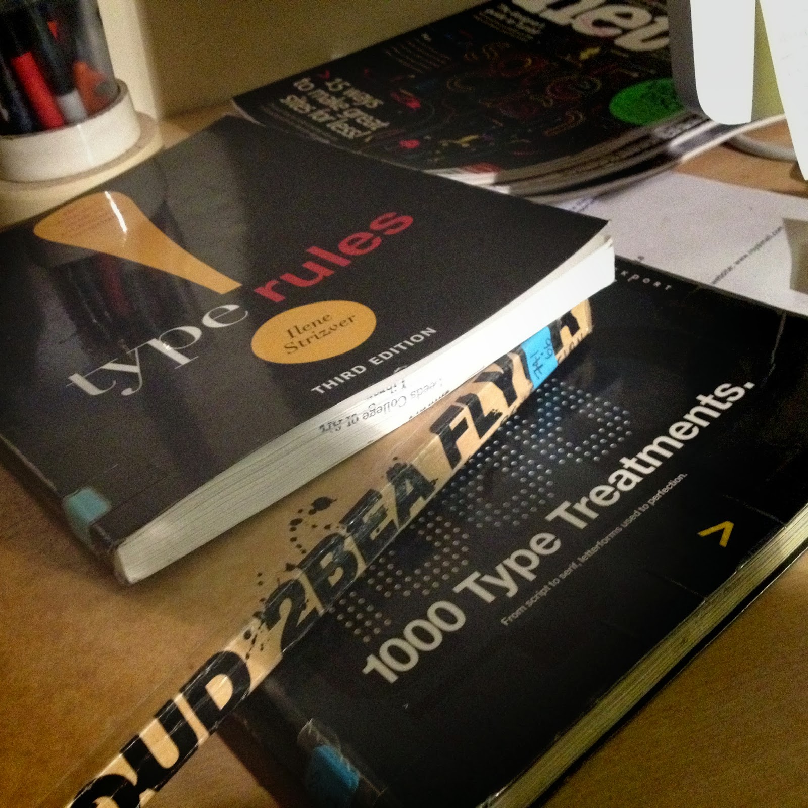
I also have a few books on loan at the moment, some for personal use, and others to directly assist this project. I thought it would be an excellent opportunity to learn more on editorial design, as it would strongly improve our informative poster/flyer. To understand layout, grid systems and type working together with a more attuned knowledge is key to making successful design. The books I feel will specifically aid our project are:
Zappaterra, Y. (2008) Editorial Design. Germany, Stiebner Verlag Gmbh.
Balius, A. (2003) Type at Work: The Use of Type in Editorial Design. England, Gingko Press.
(2004) Proud 2 be a flyer: the historical roots of a design revolution. England, Happy Books.
No comments:
Post a Comment