


The old style typography used on the London bridges signs is gorgeous, I really like the slightly curved accents for serifs. It fits the content perfectly.

On London's south-bank there's a well renowned centre for design, it's called the OXO. I'm not too familiar with it's history but it's a very old building that hosts lost of independent artisan style shops that range from ceramics to witty design orientated toy shops. With the nature of the building, the art direction is great, there is a wealth of design driven decor, and the typography there is not only cool, but considered too.

At a first glance I assumed this type to be just Futura, yet on further inspection it's clear that certain characters are slightly more stylised. Take the 'M' for example, it's much wider. Which makes me think it's either an altered version of Futura, or a different font entirely.

'London Pride' was the local ale to try whilst I was there. I can say I preferred the type on the bottle to the beer, the strong geometric characters suit the theme of the drink. I'm on the fence though as to whether to class it as a serif or san serif font. There are serif-like flicks, but only on certain characters, and they aren't very big. Either way the style works, the bottle looks great.

The reason for the trip was to visit an exhibition at 'Mother', Shoreditch. One of the first things I noticed about entering their space was the hand painted 3D type they have all over the walls. It's pretty cool, but I'm not sure how much I like the type. I think I only like it in this context, I wouldn't like to see it on commercial flyers or business cards etc.

This restaurant I've photographed is a brilliant example of how important media is when it comes to typography in a commercial world. I love the simplicity of the typeface, the geometry to it is great, and I love how the mixture of that and rustic copper creates a contrast worthy of appreciating. This is cool signage.

Another restaurant, yet in a completely different style that still seems to achieve a modern, sophisticated and high class feel: The mixture of the hand-wrote script style of photography and the geometric san serif is a pleasant one, and the simple monotone white on black is effortlessly sleek.


Again this piece of type is a great example of how the media used, and the format presented in is equally as important as the type itself. Presented in this fashion it becomes more of a piece of art rather than solely typography.

This caught my attention solely because of the ligature used on the Ampersand and the capital 'B', it's interesting use of type, however I'm not keen on the Typeface used, it would be interesting to see how it would look on a more pleasant typeface.

It's always nice to see the traditional craft in place, for that reason I couldn't help getting a picture of this stonemasonry work on Bow Lane London, a very historic road. The actual craft is so ornate, much more personal.

Nice use of Gill Sans here in a 3D style, I'll never be able to deny how great Gill Sans is, but I'm starting to wonder if it's becoming too common, there was a lot of this style of type in London.
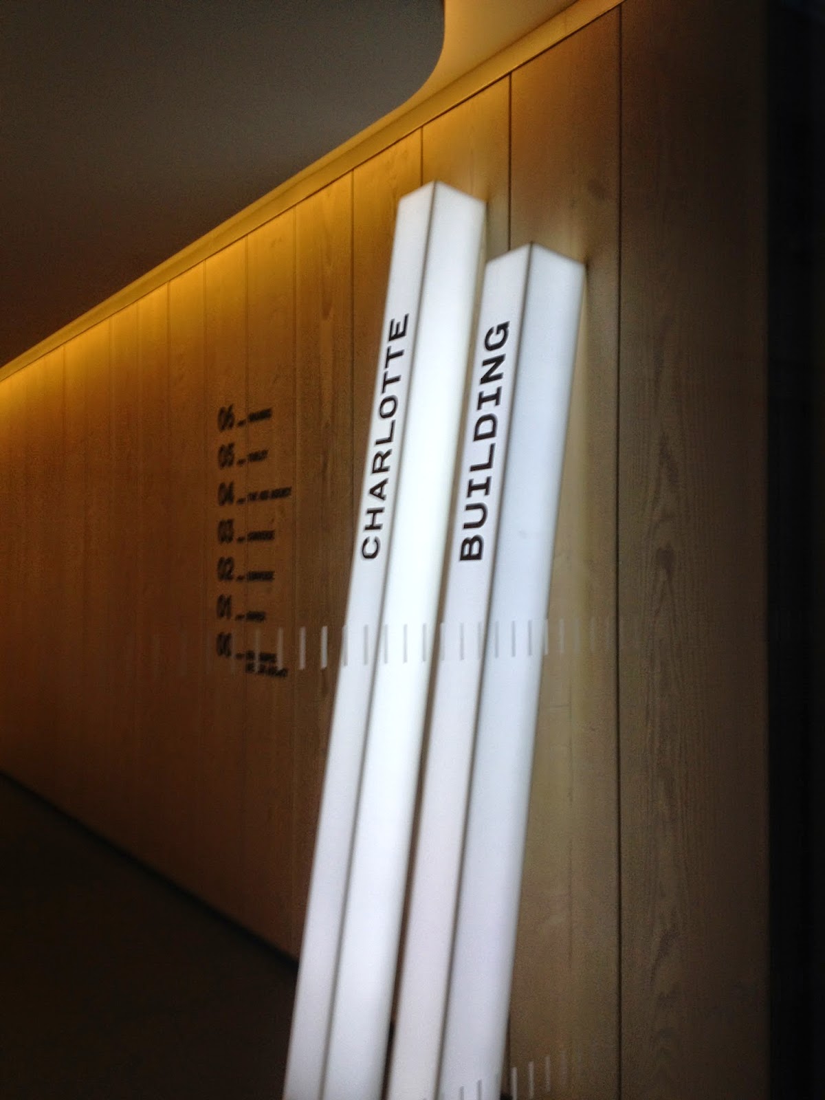
This building in London demonstrated a slick art direction with use of great type paired with interesting interior design. The white light from the light box creates a stronger contrast with the display type.

Nice piece of custom made serif typography including ligatures.

When strolling down Oxford street I noticed how great helvetica looked in this style, mounted in 3D. The element that makes this look great for me is the space that's been considered, there's a clear grid system in place on that wall and it looks great.

I picked up a copy of the Evening Standard on the tube, and I took note of the font family used in the paper. At this header size, it looks quite nice, it's definitely got it's own friendly character, with aids in setting the tone of voice for the paper.

I couldn't help taking a photo of this poster on the underground, I don't really have to explain it. In terms of ingenuity, this expresses a real understand of type. I'm not sure how relevant 'Poplar' is, but it does suit the style of the poster and fits with the illustration style.

Nice type on a shop window, it's the kind of simplistic geometric san serif that I really love. I'm especially fond of the underlining on the ampersand. It looks great.

I quite like this, but I don't really know why. On an anatomical level it goes against what I'm about when it comes to Typography, the kerning of bizarre it looks as though they've just thrown the characters up their and hope for the best. Strange.

I wanted to take this photograph to demonstrate the popularity of 'Copperplate' in typography when it comes to restaurants and bars. I suppose it's associated with a lot of positive connotations in typography, it says a similar thing to what I'd want a restaurant to say.

I like the interesting use of the letter 'F' here, to form an overline with the rest of the type, it's different, you don't see this everywhere.

Again, another nice use of a grotesk san serif typeface, it's similar looking to Gotham, but has a more unique x-height which is slightly lower.

The ornate quality to the type on this London pub is brilliant, I'd be interested to know just how old the pub is because it's shown the style of the typography.

If my guess is correct I believe the typography used here is 'Birch Std.' One of my favourite serif types, it's thin blocky style makes it great for uppercase headers. It's really classy and works great for a barbers.

Again I'm only guessing, but I do believe the typeface used here to be Futura ExtraBold Condensed, consistent with Nike and other big firms. To be honest I'm more keen on the colour scheme used here rather than the type used, but it does contribute to the overall feel.


I think of the entire trip, the typography used on the St. Pancras Renaissance hotel was my favourite. It's also one of my favourite buildings. I just love the contrast in styles, the type used is edgy, it even has a hipster quality to it. On paper I'd say pairing that kind of style with a beautifully ornate renaissance building was madness, yet it works. It looks absolutely fantastic and still connotes exactly what you'd want it to: It says that this hotel is high class, sophisticated.


Lastly, I took a particular liking to the signage used for streets in London. I actually really fancied taking one of those street signs home with me. I've searched online for what it may be, but I'm afraid I can't find it. On instinct alone I'd guess at something similar to Helvetica Condensed Bold.
No comments:
Post a Comment