


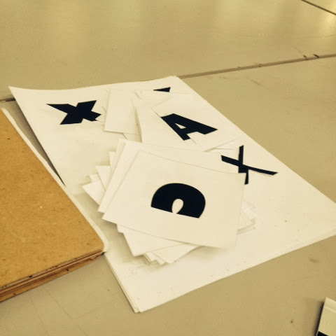


Today we developed our hand rendered typeface more. Last week we were assigned the task of picking a typeface to physically manipulate; I choose Gill Sans UltraBold, purely because I thought there was a lot of potential in terms of manipulation. It's already quite a chunky font, so taking pieces away would be effective. Above you can see how the process I went through was cutting and halfing the left hand side of the characters.
What we've done today is develop the potential for bold, italic & light versions of our Typefaces by using a combination of tracing paper, masking tape, rulers & pens. It's interesting to see how the changes I've made to my first character (X) are going to look on other letterforms, I can imagine it will be challenging at some point.
We've also been challenged to exaggerate the way we make our characters bolder and lighter, and to experiment with the legibility of our letterforms.
Here's the Typefaces I had to choose from, and the changes I started to make with a scalpel & tape:


It will be interesting to see how the physical manipulations I've made will translate when I get them done in Illustrator.
No comments:
Post a Comment