Less is more! You’ve definitely heard that old saying before, and it couldn’t apply more to the genre of minimalist photography. People’s exact definitions of minimalist photography may vary from person to person, but in general, this style of photography can be summed up in the following way.
It makes sure that all of the attention
is focused upon the photo’s subject without—and this is what’s extremely important—any elements in the photo that would distract from the subject.
Therefore, any elements in the photo have to be kept at a minimum, yet the few elements that are there ought to still be highly meaningful to the photo’s overall idea. In short, it conveys a scene by utilizing as few elements as possible.
While an extraordinarily interesting genre, minimalist photography isn’t that popular yet. In our culture, it is sometimes difficult to appreciate minimalism because of all the excess around us. However, if it tickles your fancy, you can be ahead of the curve and develop into a master minimalist photographer. Here’s how you do it.
1. Familiarize Yourself With Minimalism
Minimalism is a philosophy, and you must understand it intimately to make it appear in your pictures.
Minimalism can be witnessed in the styles of a great number of 20
th-century artists such as Dan Flavin, Agnes Martin and Donald Judd. Their art was defined by a minimum quantity of components like shape, color, texture and line. Among artists, this approach is seen as highly subjective because it leaves both meaning and interpretation up to the viewer’s conception of the work.
Some people enjoy the absolute openness and freedom in this genre, yet others detest both the dearth of subject matter and lack of direction. So, yeah, minimalism has its defenders and haters, but what genre doesn’t?!

Minimalism at its finest!
The good news for you photographers out there is that this is not so much an issue for you. The reason for this is because a picture is simply a real-life snapshot of a moment that’s been captured on film. Even so, photographers have the chance to take advantage of minimalism’s tactics to greatly increase the impact of their art.
2. Keep It Simple!
Keeping things
simple is the most vital rule of minimalism. Don’t overthink things, and don’t overanalyze them. The key thing to remember is that this doesn’t mean that your minimalist snapshots will be boring or lacking in interesting elements. A good start is to choose a subject that will instantly catch the viewer’s eye. In minimalist photography, the subject always has to be the most powerful element of the photo, although it may not even occupy the majority of the space!
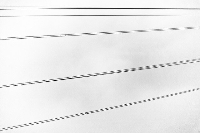
Perfect examples of simple subjects that still catch the eye are power lines against a backdrop of the sky, a lone human form against a massive wall, and even a close-up shot of dry, cracked earth.

You can’t get any simpler than this!
Prior to taking your picture, take some time to think hard about what you’re going to put into your shot. At the same time, consider what you will leave out of the frame. The space surrounding the subject is going to highlight its prominence, so don’t be afraid to either crop out possible distractions and zoom in on the subject. For instance, if you have a landscape shot of a shopping mall crowd, leave out the majority of the people and just focus on one individual.
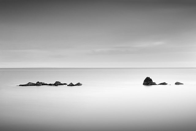
3. Use Negative Space in Composition
Smart use of composition is always a plus in any genre of photography, and it’s no different for the minimalist genre. One of the most important elements of composition that you should work into your minimalist shots is negative space. Negative space is space around as well as between the subject or subjects.
The incorporation of
negative space is sometimes underused in photography, but here’s where you can make it truly shine. It’s been said that the utilization of negative space as part of the composition of minimalist photography is absolutely integral to its success. Sometimes, photographers will just ignore this crucial rule, which is too bad, because they get caught up obsessing about the subject matter of the shot. Don’t let this happen to you!

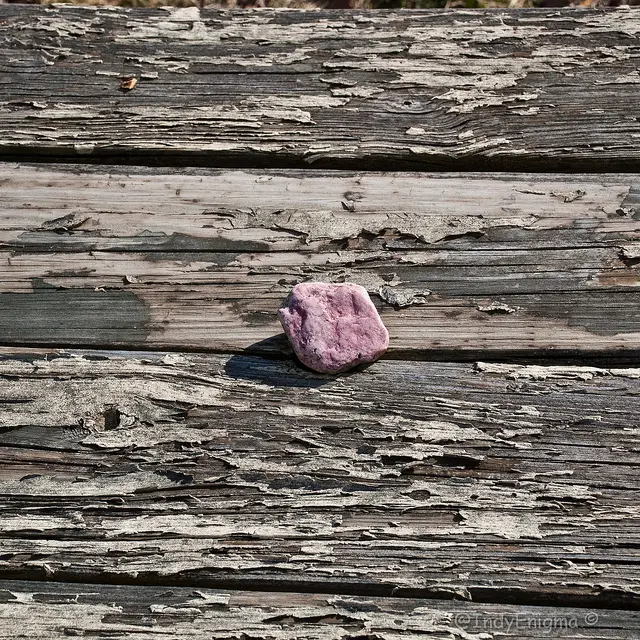
Note the use of negative space around the pink rock.
Minimalist photography is about emphasizing the lone subject, so use negative space to help you do this. If, for example, your subject is a rock against a plain background, zoom out with your lens to make the rock appear even smaller against the background. This creates more negative space (the plain background) that puts more emphasis on your subject (the rock). Minimalism at its finest!
4. Use Color Indulgently
Since minimalist photography relies on keeping things basic, the one area you can really use to make up for this is in color. Though your photo will still be simple, which is the philosophy of the minimalist, you can make it more eye-catching by effective use of color.
One of the most strategically effective techniques you can use is to
increase the saturation. If you only have very few elements in your shot, then emphasizing the color of the elements is the winning solution. It will draw the eye to the shot and make it stand out with greater urgency. Never mind subtlety in this genre!

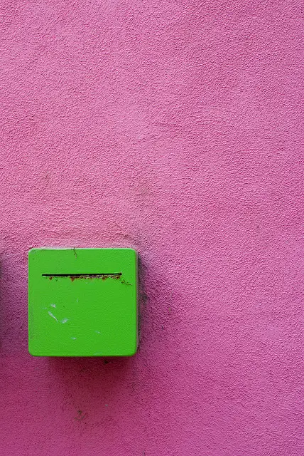
Contrasting colors–see them stick out!
It’s also intelligent to intentionally pick
complimentary colors in your minimalist photos. Examples of complimentary colors are orange and blue, red and green, and purple and yellow. Just imagine how amazingly intense any one of these colors against a complimentary background will appear! Your minimalist shot will stick out the way it needs to.
5. Distractions Are Adverse, so Crop Them Out!
An otherwise minimalist photo can get ruined by unnecessary distractions. A good rule of thumb is that anything that goes beyond a few picture elements is a distraction. So how do you solve the problem of distractions? Simply
crop them out of the frame!
When you crop out your shot, you should edge out the details. This will not just do away with annoying distractions, but it will also infuse some sort of feeling of space into your pictures. Remember this technique, since it can be very useful on many occasions.

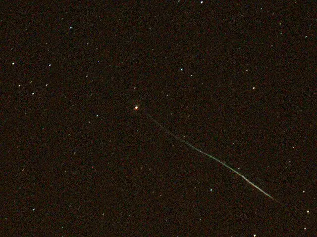
Cropping can be used to get rid of all other stars and only make one star in this picture the subject.
Sometimes, though, there are going to be exceptions to the rule, as with everything else. If the distracting details are right in the middle of your shot, you unfortunately can’t just easily crop them out. However, not all’s lost because you can always start to familiarize yourself with Photoshop to efficiently edit your shots so that distracting details are removed.
If you’re up for learning to use Photoshop to improve your minimalist shots, then head over to Amazon.com to buy
Photoshop.
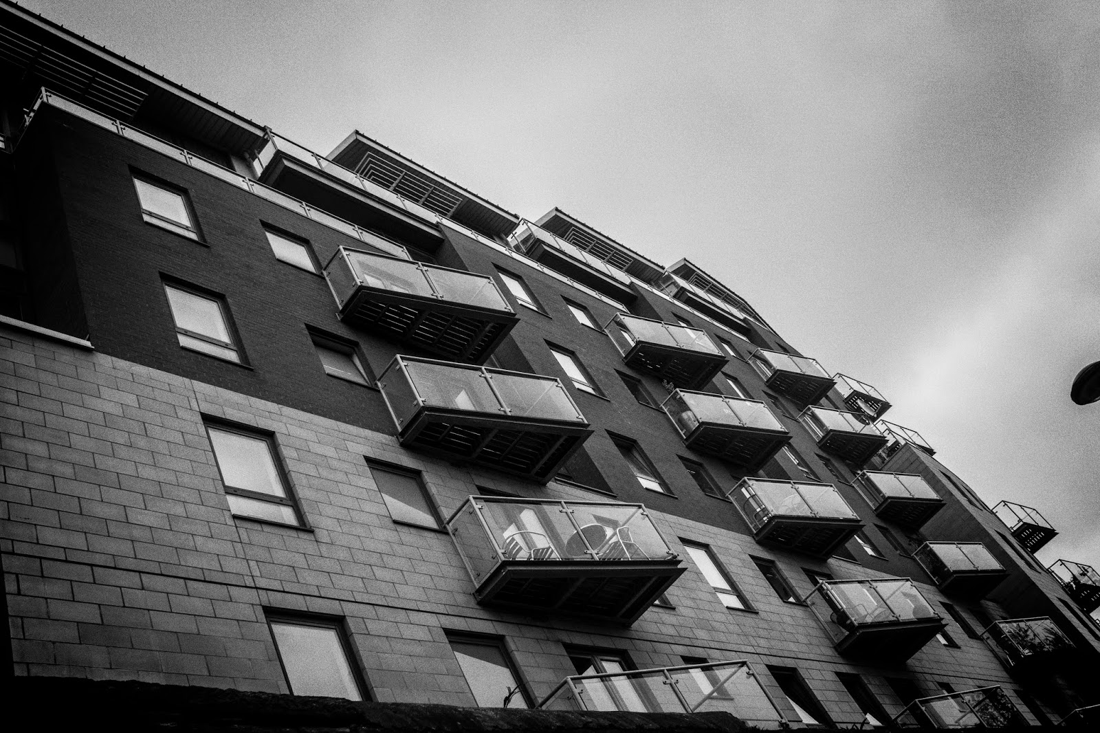
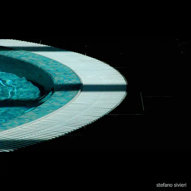
6. Stick to the Plainest of Plain Backgrounds
Plain backgrounds are extremely helpful at developing your minimalist shots. This makes a world of sense since plain backgrounds are extremely free of distractions and epitomize minimalism at its finest. Sure, studio backgrounds are great at concealing distracting objects, but this only works indoors.
When you’re outside, though, your whole environment changes, so use backgrounds like simple fences and even plain walls. If you happen to be taking pictures of small subjects like flowers, you can really go all out and even take your own backgrounds with you in the field!

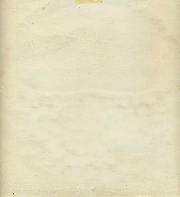
This plain background is the ideal minimalist background.
If you’re fond of shooting small subjects like flowers, then keep this in mind: Lower your angle. This will cause you to shoot up at the flowers, which means the sky is your background. This works beautifully, technique-wise, to provide you with a natural minimalist background!
On the issue of the actual color itself, white is a natural choice for a minimalist background for obvious reasons. Still, don’t think that you can’t utilize a bold and powerful color as well.
7. Respect The Rule of Thirds
Minimalist photography is a great excuse to catch up with the
rule of thirds, which is one of the elementary rules of picture-taking. A quick recap: The rule of thirds permits you to snap well-balanced pictures by sharply dividing the space into three vertical/horizontal parts and positioning any points of interest where the gridlines intersect. There are four intersections on this grid on which you should place points of interest. Studies have established that a viewer’s eyes will naturally drift to these intersection points instead of to the center!

Note the three vertical/horizontal parts.
The beauty of incorporating the rule of thirds in minimalist photography is that you truly have a showcase to make it work. A person glancing at your photos will comprehend your symbolism and your own interpretation with greater ease since you’re essentially directing their eyes to your photo’s object of interest.
Let’s say that your minimalist photography subject is a person’s face. You want to position the eyes of your subject along the gridlines and at least one eye as close as possible to one intersection point. Another example is if you’re shooting a minimalist landscape of an empty field. Place the horizon along one of the gridlines for brilliant effect.
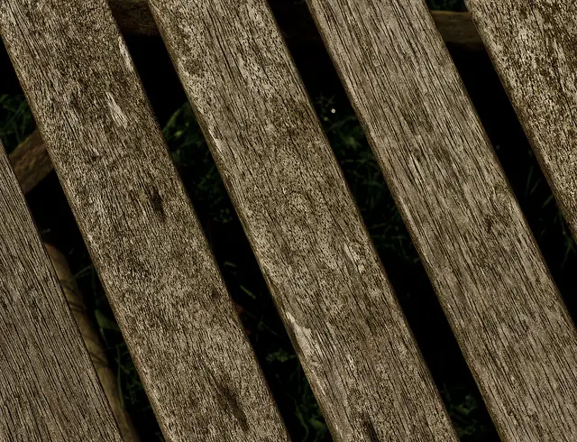
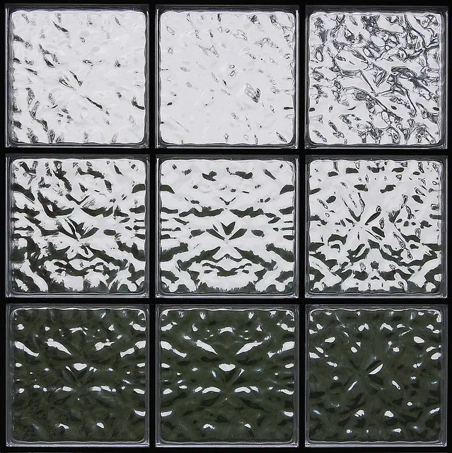
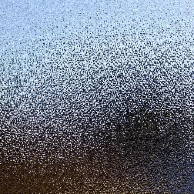
8. Infuse Your Shots With Texture
One of the most significant foundations of minimalist art is texture, so why not just apply it to photography also? Besides color, the interesting
use of texture was really one of the most oft-repeated elements that minimalist photography built its brand on. The beauty of incorporating texture effectively into your shots is that you can catch the eye of your viewer without even having to bother with including a distinct subject matter!
To make this work wondrously, you require not just an interesting surface. You need a method of capturing it effectively.

The use of minimalist texture at its finest.
To do this, analyze whether the texture has any direction and if that line can be utilized smartly in a compositional context. Attempt to leverage light so that it actually improves the texture as well as brings forth the contrast. You want to capture an image so the effect on the viewer is that he nearly feels what he’s looking at.
Bonus: Here Are 8 Suggestions to Get You Started on Minimalist Photography Right Now!
1. Take a picture of power lines against the sky.
2. Find an interesting pattern in some floorboards and shoot away.
3. Use the rule of thirds on a landscape shot. Make sure the horizon’s set along one of the gridlines.
4. Find a red rose and make it the sole subject of your photo. Shoot it against a green lawn background to take advantage of the complimentary colors effect.
5. Wait until wintertime. Find some fresh footprints in the snow, and take a minimalist photo.
6. Locate a really plain background—like sand at the beach—and create some patterns in it to photograph.
7. Wait until it rains. Find a window with rain drops dripping down, and take a shot of this interesting effect.
8. Take a picture of a piece of wood, and admire all the fine examples of texture in the grain.
Bonus #2: Gallery of the Most Awesome Minimalist Shots Ever

Beautiful use of the horizon close to a rule-of-thirds gridline.

Note the effective use of shade and contrast.

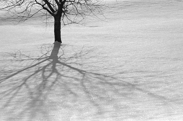
What brilliant use of negative space!

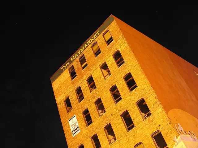
A minimalist shot…at night.

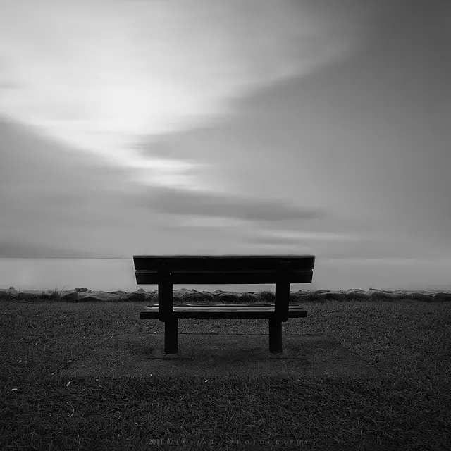
The lonely subject of a park bench.
What to Take Away From This
Minimalist photography is not a genre that you master overnight! It’s hard to make the transition to thinking in a minimalist style because we’re bombarded with such excess in our “bigger-is-better” culture and society. But if you can look past this excess and truly appreciate the beauty of minimalism, then you’re on your way to taking your art to a whole new level.
Remember to really understand what minimalism’s all about before you throw yourself into this interesting though underexplored genre of photography. Work with the basics like color and texture in keeping with the minimalist philosophy, and experiment with both to get mind-blowing results. Then work your way up to other techniques like the incorporation of the rule of thirds and cropping out any distractions. Before long and with practice, you’ll be a master minimalist photographer!