Commercial print generally covers:
- Offset Lithography
- Digital Printing
- Screen Printing
We're focusing specifically on the use of colour within software. Just to recap:
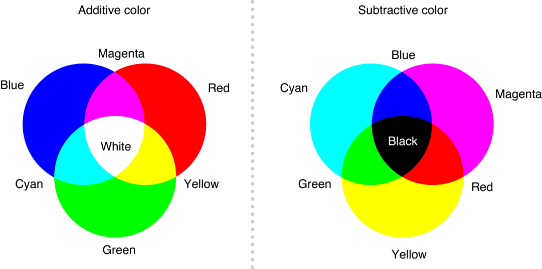
CMYK: Subtractive colour, generally ink on paper. Also generally referred to as 'process' colour.
RGB: Additive colour, colour through the use of light; monitors, projects etc.
I generally get subtractive and additive colour methods mixed up, so to make it easier to remember, know that when 'adding' colour through light, white is the pure light, making RGB additive. When 'adding' colour through pigment/ink CMYK, you eventually reach black which is technically the absence of colour, making it subtractive.

Here's an example of the stuff we were going through, swatches were a big part of this tutorial. We were mentioning the advantages of preparing custom made swatches, in terms of consistency they're really useful.
Global colours: This option basically enables all elements using this colour to linked, any changes made to the swatch will change the elements too. Again a useful tool for consistency.
Remember, asking about colour books (PANTONE CMYK uncoated, coated, metallic etc), stock, spot colours with a commercial printers is definitely a good starting point!
Spot colours: These are colours that are prepared for the printing process manually. The benefits of these include cost efficiency, consistency (particularly useful for branding) and for printing finishes that can't be achieved through CMYK alone like metallic coats.
Adobe Swatch Exchange: A universal system for recovering saved custom swatch palettes. Extremely convenient for if you're working on a project throughout different pieces of Adobe Software.
I was aware of a lot of this information, but todays session has ben brilliant for filling in a lot of the gaps when it comes to commercial print processes.


No comments:
Post a Comment