Monday, 24 November 2014

COP - Deciding on an Essay Theme/Question

Here's where I'm at with my Context of Practice essay theme/question so far:

"The need to communicate will always exist. The medium through which we communicate is subject to change and dependant on technologies and and social development. In a future existence, where do you see the creative industries? Will they be challenged? Or will they thrive under new medias?"

With this in mind, an example of new media that I wanted to look into further was virtual reality, and how in a few years time it may develop into something that could be quite isolating. To get a better idea of how I've looked at this example further, check out this link to a writing prompt I made on Reddit. It's essentially a theme for a piece of fiction, but is useful and relevant to my essay:

https://www.reddit.com/r/WritingPrompts/comments/2j30gy/wp_virtual_reality_escapism_as_religion/

I also want to take the opportunity to stress that I'm not only looking a virtual reality. Technology is another area I want to look at in detail.

We've had a critique today, where we've had the opportunity to get some feedback on our theme. This has been helpful, what I've learned is that I shouldn't focus too much on the future, as no-one really has any grounds to predict what's going to happen. And instead look at how Graphic Design has had to adapt to evolving technologies in the past, is adapting to changes now, and may adapt to potential changes in the future.

With this in mind, I'd like to amend my original statement/question:

"The need to communicate has and always will exist. The medium through which we communicate is subject to change and dependant on factors like technology and social development. How has/does the role of the Graphic Designer adapt(ed) and change(d) to suit an evolving world, how will it continue to adapt and change?"

Perhaps this is still too complex. I'm sure I'll change it again at some point to derive a more concise theme. However for the time being I'm pleased with the changes I've made and think this will positively reflect the direction of the project.
Friday, 7 November 2014

Studio Brief 3 - Web Style Guides

Today we're doing web style guides. The way I see it is pretty much as a digital design board for web. It covers all the design elements of the page, and doesn't relate to content. Elements covered by design style guides include:

- Font families: Header, Body etc.
- Colour: RGB, HEX codes, web safe colours, background, foreground, palettes etc.
- Button Style: Colour, image, default, hover, active.
- Logo & Variations.
- Grids & Layouts, variations, sub pages etc.

These are some pretty good examples of some web style guides. I'll post my design outcome on my Design Practice blog.


Thursday, 6 November 2014

Studio Brief 3 - 'Design for Print' Workshop 1

The purpose of this workshop is to better appreciate the considerations for preparing digital artwork or layout that will be commercially printed. We're covering these considerations in regard to Adobe Photoshop, Illustrator & InDesign.

Commercial print generally covers:
- Offset Lithography
- Digital Printing
- Screen Printing


We're focusing specifically on the use of colour within software. Just to recap:

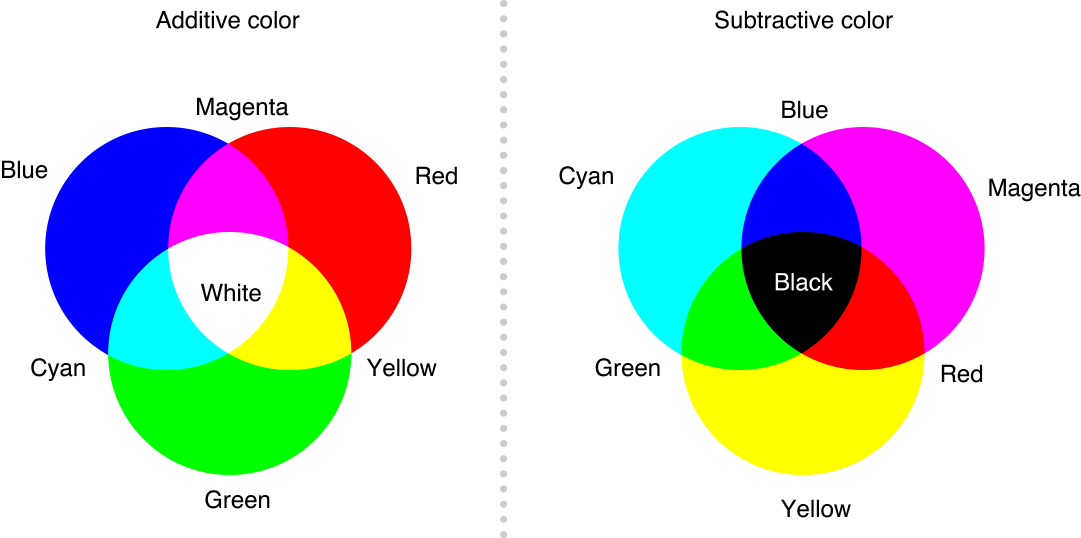
CMYK: Subtractive colour, generally ink on paper. Also generally referred to as 'process' colour.
RGB: Additive colour, colour through the use of light; monitors, projects etc.

I generally get subtractive and additive colour methods mixed up, so to make it easier to remember, know that when 'adding' colour through light, white is the pure light, making RGB additive. When 'adding' colour through pigment/ink CMYK, you eventually reach black which is technically the absence of colour, making it subtractive.


Here's an example of the stuff we were going through, swatches were a big part of this tutorial. We were mentioning the advantages of preparing custom made swatches, in terms of consistency they're really useful.


Global colours: This option basically enables all elements using this colour to linked, any changes made to the swatch will change the elements too. Again a useful tool for consistency.

Remember, asking about colour books (PANTONE CMYK uncoated, coated, metallic etc), stock, spot colours with a commercial printers is definitely a good starting point!


Spot colours: These are colours that are prepared for the printing process manually. The benefits of these include cost efficiency, consistency (particularly useful for branding) and for printing finishes that can't be achieved through CMYK alone like metallic coats.

Adobe Swatch Exchange: A universal system for recovering saved custom swatch palettes. Extremely convenient for if you're working on a project throughout different pieces of Adobe Software.


I was aware of a lot of this information, but todays session has ben brilliant for filling in a lot of the gaps when it comes to commercial print processes.